Masonry Layout Implementation and Optimization
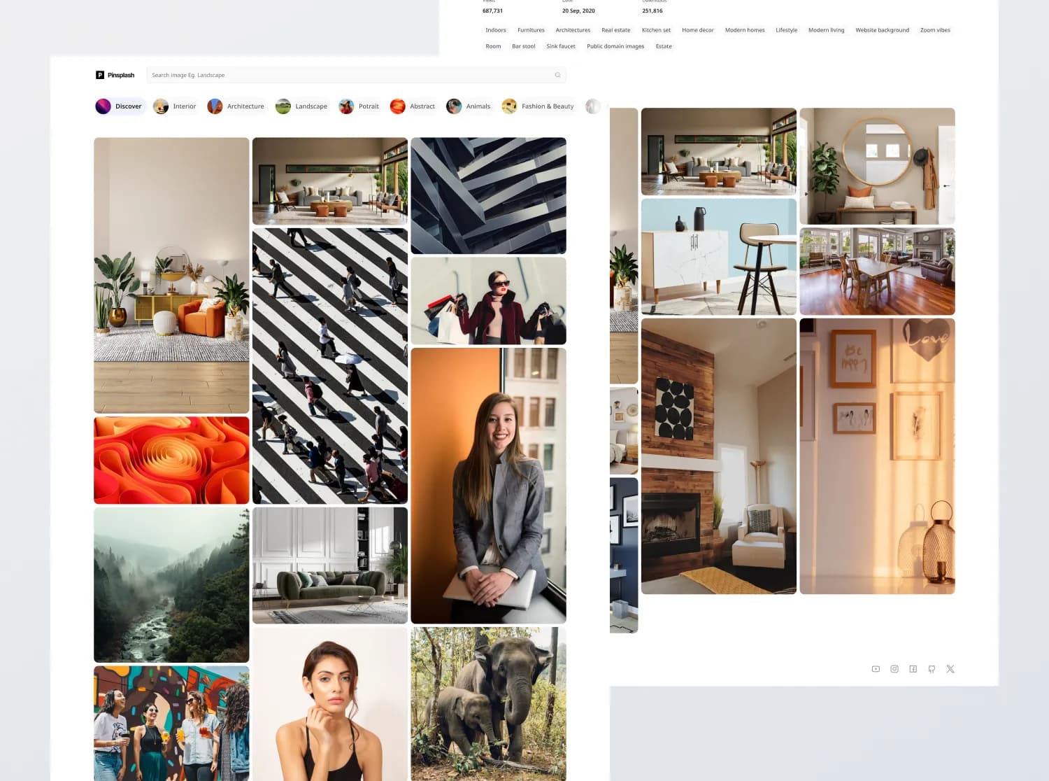
Masonry layout is a popular and flexible grid-based layout design. Unlike traditional grids, where elements in the same row have the same height, elements are placed within columns but can have varying heights, resulting in a more organic and visually interesting arrangement.
Such a layout uses space efficiently as it fills up most of the available screen estate with its contents and leaves little white space between elements. It is commonly used for presenting user-generated media like images and GIFs. The most famous site with this layout is Pinterest.
A masonry layout is notoriously difficult to implement. Achieving the signature "brick wall" or staggered layout of masonry requires precise positioning of items. This can be complex, especially when we want items to fit together neatly and utilize the available space optimally.

Key Features
- Media Loading: Efficient image handling with techniques like lazy loading and responsive image optimization.
- Layout and Rendering: Flexible masonry grid layout that adapts seamlessly to varying content sizes and screen widths.
- Design Fidelity: Pixel-perfect implementation that ensures consistency with design mockups.
- Performance Optimization: Enhanced user experience with minimized load times and optimized rendering strategies.
Row of columns
This method involves rendering equal-width columns then placing items within each column. This approach heavily leverages the browser for positioning.
The pros of this approach are that it is easy to implement as it leverages display: flex and the required CSS is not very complex. If the height of any item changes, the positions of the items within that column will be updated automatically.
However, one huge downside is that the DOM order is now column-first. Imagine a keyboard user wants to get to the top pin in the rightmost column. With such a DOM:
<div class="container">
  <div class="column">
    <!-- Focus is currently here -->
    <div class="item">1</div>
    <div class="item">2</div>
    <div class="item">3</div>
    <div class="item">4</div>
  </div>
  <div class="column">
    <div class="item">5</div>
    <div class="item">6</div>
    <div class="item">7</div>
    <div class="item">8</div>
    <div class="item">9</div>
  </div>
  <div class="column">
    <!-- Desired pin requires pressing the "Tab" key 9 times -->
    <div class="item">10</div>
    <div class="item">11</div>
    <div class="item">12</div>
    <div class="item">13</div>
  </div>
</div>
The following example is implemented using the "row of columns" layout and the numbers within the items indicate the elements tabbing order.
Performance Testing Approach
To ensure the most accurate and stable performance metrics during development, we use the following approach for testing:
-
Local Environment Testing: We rely on
yarn buildandyarn previewto create and serve a production-like build locally. This approach minimizes network variances and provides consistent testing conditions.yarn build yarn previewAfter starting the local server, we use Google Lighthouse to audit the site’s performance directly in the browser, focusing on metrics like LCP (Largest Contentful Paint), TBT (Total Blocking Time), and CLS (Cumulative Layout Shift).
-
Production Environment Testing: At the end of the implementation phase, we test in production conditions. This involves deploying the code (e.g., to Vercel) and running Lighthouse multiple times to account for variances in real-world scenarios. Averages from these tests will give us a better sense of user-facing performance.
Layout Shift and Blurhash
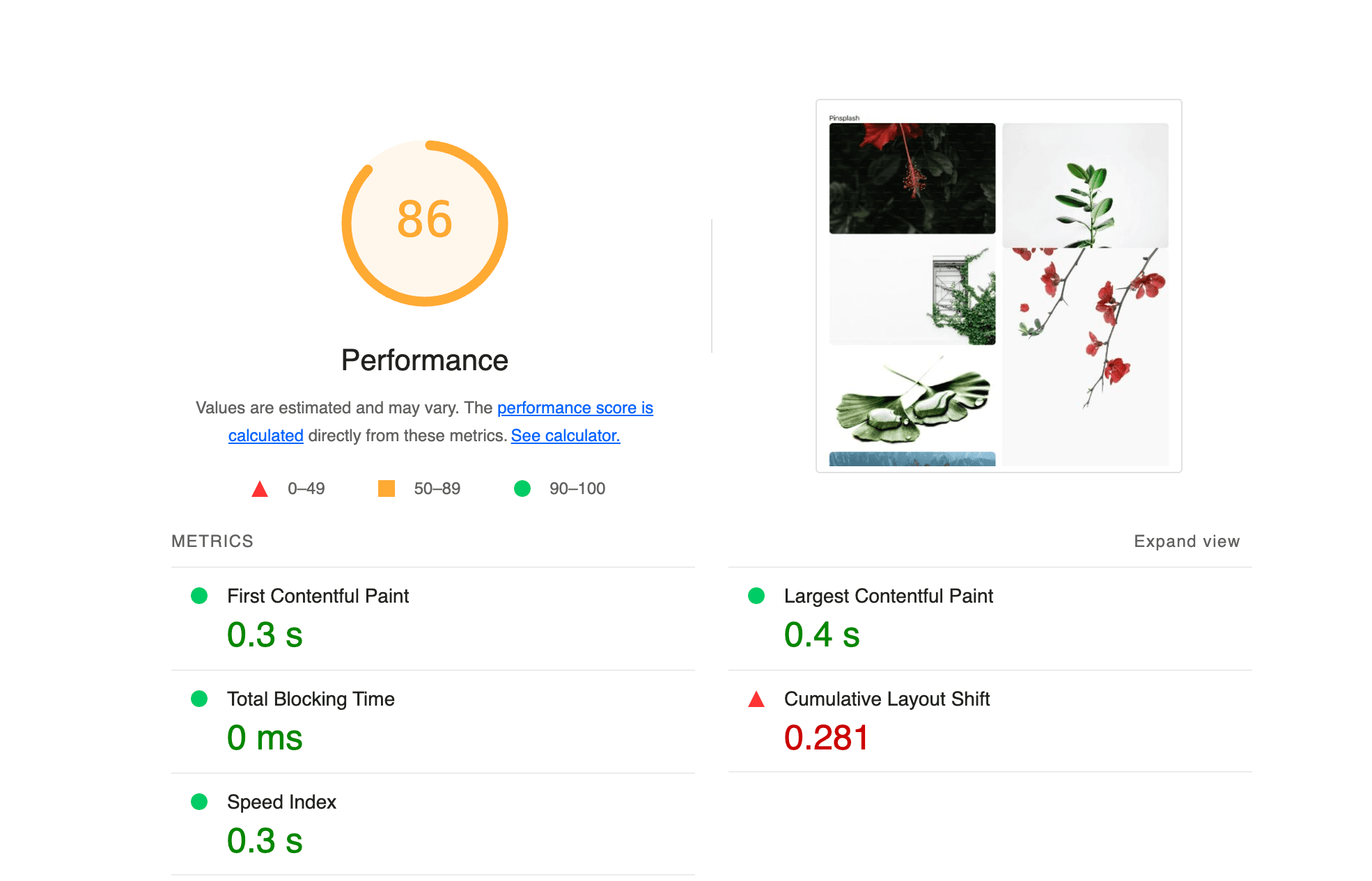
When implementing the initial masonry layout with images from the Unsplash API, we noticed significant penalties due to Cumulative Layout Shift (CLS). This metric measures unexpected shifts in layout while the page is loading, which negatively impacts the user experience.

Solution: Blurhash Placeholders
To mitigate CLS, we leveraged the blurhash feature provided by the Unsplash API. Blurhash generates a blurred, low-quality placeholder that matches the dimensions of the final image. This allows us to reserve space for the image during loading, preventing layout shifts.
All photo objects returned by the Unsplash API include a blur_hash string. This is a very compact represenation of an image placeholder which can be used to display a blurred preview before the real image loads.
[
  {
    "id": "LBI7cgq3pbM",
    "created_at": "2016-05-03T11:00:28-04:00",
    "updated_at": "2016-07-10T11:00:01-05:00",
    "width": 5245,
    "height": 3497,
    "color": "#60544D",
    "blur_hash": "LoC%a7IoIVxZ_NM|M{s:%hRjWAo0",
    // ... more
  }
]
Here is the "blur_hash": "LoC%a7IoIVxZ_NM|M{s:%hRjWAo0" string for a photo object. We can use this string to generate a placeholder image that will be displayed while the real image is loading.
Implementation Plan
- Create the ImageLoader Component: This component will handle rendering blurhash placeholders during image loading. Once the image is loaded, it will replace the placeholder seamlessly.
- Integrate Blurhash: We will use the blur_hash field from the Unsplash API response and provide width and height to ensure space is reserved for the image.
- Test with Lighthouse: After implementing ImageLoader, we will rerun the Lighthouse test to verify improvements in the CLS score.
With these adjustments, the user experience will be significantly enhanced, providing a smoother and more visually appealing interface.
// Example Usage of the ImageLoader Component
<ImageLoader
  imageUrl={photo.urls.regular}
  blurhash={photo.blur_hash}
  width={photo.width}
  height={photo.height}
  alt={photo.description || 'Unsplash image'}
/>
By addressing CLS early in the development cycle, we ensure our layout is performant and user-friendly from the start.
Here's the full component implementation:
import { useEffect, useState } from 'react';
import { Blurhash } from 'react-blurhash';

function ImageLoader({
  aspectRatio,
  alt,
  blurhash,
  imageUrl,
  width,
  height,
  srcSet,
  sizes,
}: {
  aspectRatio?: string;
  alt: string;
  blurhash: string;
  imageUrl: string;
  width: number;
  height: number;
  srcSet: string;
  sizes: string;
}) {
  const [loaded, setLoaded] = useState(false);

  useEffect(() => {
    const image = new Image();

    image.onload = () => {
      setLoaded(true);
    };

    image.src = imageUrl;
    image.srcset = srcSet;
    image.sizes = sizes;
  }, [imageUrl, sizes, srcSet]);

  return (
    <div
      style={{
        backgroundColor: '#948cf988',
        position: 'relative',
        aspectRatio: `${aspectRatio ? aspectRatio : width / height}`,
        marginBottom: '16px',
        borderRadius: '8px',
        overflow: 'hidden',
      }}
    >
      {/* Blurhash */}
      <div
        style={{
          position: 'absolute',
          top: 0,
          left: 0,
          width: '100%',
          height: '100%',
          opacity: loaded ? 0 : 1,
          transition: 'opacity 0.5s ease',
        }}
      >
        <Blurhash
          hash={blurhash}
          width="100%"
          height="100%"
          resolutionX={64}
          resolutionY={64}
          punch={1}
        />
      </div>

      {/* Image */}
      <img
        src={imageUrl}
        alt={alt || 'Image sans description'}
        srcSet={srcSet}
        sizes={sizes}
        style={{
          objectFit: 'cover',
          objectPosition: 'center',
          width: '100%',
          height: '100%',
          borderRadius: '8px',
          display: 'block',
          opacity: loaded ? 1 : 0,
          transition: 'opacity 0.5s ease',
        }}
        loading="lazy"
      />
    </div>
  );
}

export default ImageLoader;
Here's the result of the Blurhash implementation:
Optimizing Images with srcset for Adaptive Loading
In a media-rich application like ours, ensuring optimal image loading is critical to providing a seamless and visually appealing user experience. Using the srcset attribute allows us to serve the most suitable image size based on the user's device resolution and viewport size. This not only improves performance by avoiding unnecessary bandwidth usage but also ensures that images look crisp on all screen types, including high-DPI devices.
Why srcset is Important
-
Performance Optimization:
- Small devices with lower resolutions do not need large image files, which can be unnecessarily heavy and slow to load.
- By serving lighter images for smaller devices, we reduce load times and improve performance metrics like Largest Contentful Paint (LCP).
-
Visual Fidelity:
- For devices with high pixel densities (e.g., retina displays),
srcsetallows us to serve images with sufficient resolution to avoid appearing blurry.
- For devices with high pixel densities (e.g., retina displays),
-
Bandwidth Efficiency:
- Mobile users, especially those on slower or limited networks, benefit from optimized image sizes, reducing data usage without compromising quality.
How srcset Works
The srcset attribute provides a list of image sources, each paired with a descriptor (e.g., w for width). The browser evaluates these sources and selects the most appropriate one based on the device's screen size and resolution.
Example:
<img
  src="https://example.com/image-400.jpg"
  srcset="
    https://example.com/image-200.jpg 200w,
    https://example.com/image-400.jpg 400w,
    https://example.com/image-800.jpg 800w
  "
  sizes="(max-width: 600px) 100vw, (max-width: 1024px) 50vw, 33vw"
  alt="An example image"
/>
Breaking Down the Example
-
srcsetAttribute:- Specifies multiple image versions with their widths.
- The browser chooses the best match based on the device's viewport and pixel density.
Example breakdown:
https://example.com/image-200.jpg 200w: Use this for small displays or low-resolution screens.https://example.com/image-800.jpg 800w: Use this for larger displays or high-resolution screens.
-
sizesAttribute:- Defines how much of the viewport width the image should take up for various screen sizes.
- In this example:
(max-width: 600px) 100vw: On screens up to 600px wide, the image takes up the full viewport width (100vw).(max-width: 1024px) 50vw: On screens up to 1024px wide, the image takes up half the viewport width (50vw).- Default:
33vwfor larger screens.
-
altAttribute:- Provides an accessible text description for the image, essential for screen readers and SEO.
Implementation in Our Application
For our masonry layout, we leverage the srcset and sizes attributes to load the most suitable image for each device. Here's how it looks in our project:
<ImageLoader
  srcSet={`
    ${photo.urls.thumb} 200w,
    ${photo.urls.small} 400w,
    ${photo.urls.regular} 1080w,
    ${photo.urls.full} ${photo.width}w
  `}
  sizes="(max-width: 600px) calc((100vw - 48px) / 2),
         (max-width: 1024px) calc((100vw - 48px) / 2),
         calc((100vw - 64px) / 3)"
  imageUrl={photo.urls.regular}
  alt={photo.alt_description || photo.description || 'Unsplash image'}
  blurhash={photo.blur_hash}
  width={photo.width}
  height={photo.height}
/>
Explanation of Sizes
-
Mobile (max-width: 600px): Two columns layout with 16px gaps between images. Each image takes
(100vw - 48px) / 2(viewport width minus gaps). -
Tablet (max-width: 1024px): Two columns layout similar to mobile.
-
Desktop: Three columns layout with
(100vw - 64px) / 3(adjusted for wider screens).
Benefits Observed
-
Improved Performance: Lighthouse audits show reduced load times and smaller network payloads for mobile devices.
-
Enhanced Visuals: Images look sharp and high-quality on retina and large displays.
-
Scalability: Adapts seamlessly to different devices and layouts, making the design future-proof.
By incorporating srcset and sizes, we optimize the loading process for diverse devices, ensuring an efficient, user-friendly experience while maintaining high design fidelity.
This video demonstrates how images dynamically adjust their loading based on screen size and resolution, ensuring optimal performance and visual quality:
Layout optimization
Categorizing Images for a Harmonious Layout
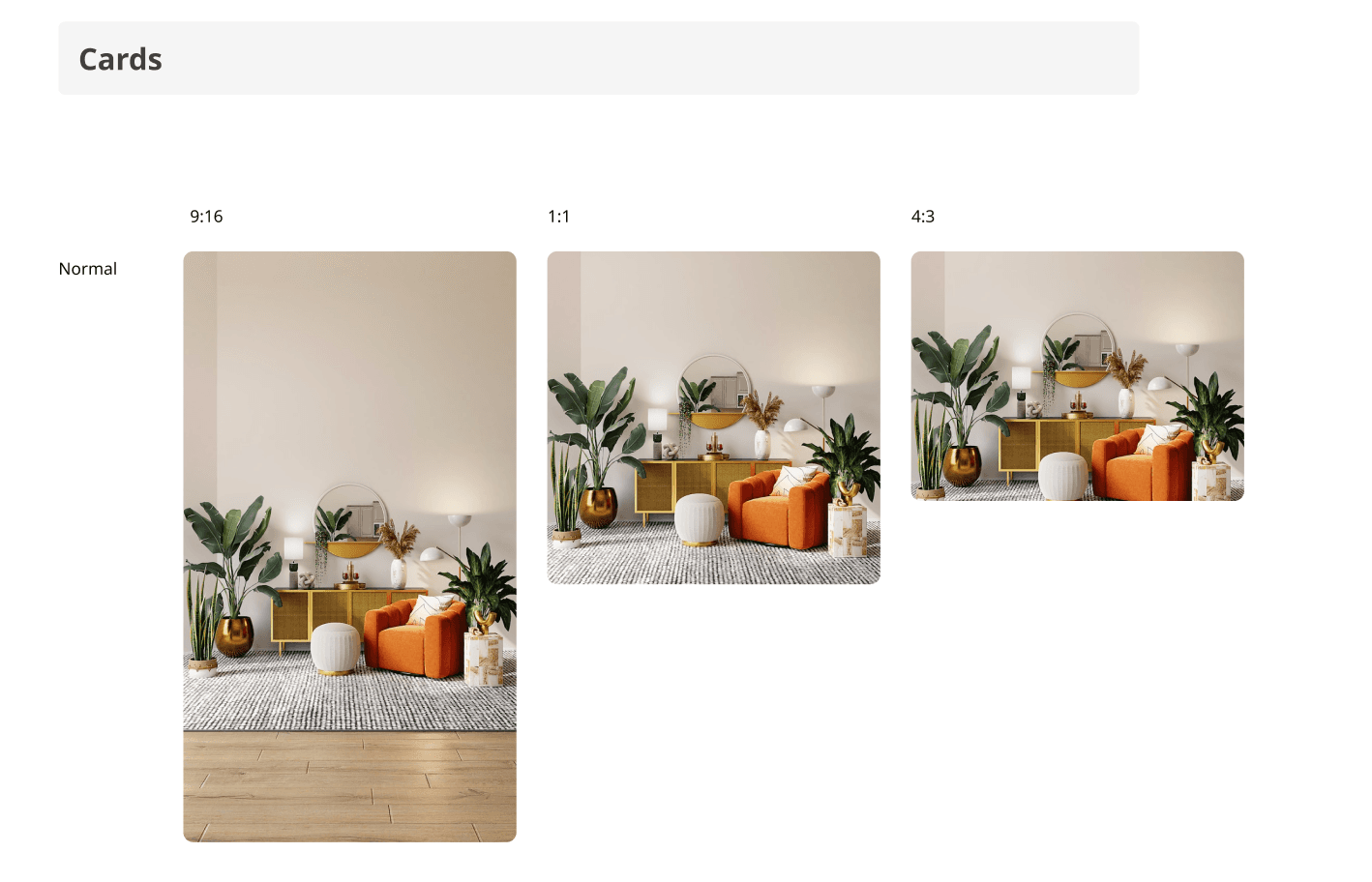
To achieve a visually appealing and organized design, we categorize images into three specific aspect ratio categories: portrait, landscape, and close-to-square. This categorization ensures consistency in the layout and aligns closely with the design specifications, creating a more polished and cohesive look.
- Portrait (9:16): Images with a taller height than width, typically in a 9:16 aspect ratio. These images are displayed in a single column to emphasize their vertical orientation and ensure they don't disrupt the flow of the layout.
- Landscape (4:3): Images with a wider width than height, usually in a 4:3 aspect ratio. These images are displayed in two columns to showcase their horizontal orientation while maintaining visual harmony across the layout.
- Close-to-Square (1:1): Images with nearly equal width and height, forming a square or close-to-square aspect ratio. These images are displayed in three columns to balance the layout and fill the available space effectively.
By grouping images into these categories, we ensure that the design adheres to its aesthetic goals while optimizing the usage of available screen space.
This structured approach, combined with the height balancing algorithm described below, forms the foundation for an elegant and harmonious masonry layout.

The Problem with Unguided Composition
Without a proper algorithm to manage the placement of images, the layout can quickly become visually unbalanced. Columns may have uneven heights, leaving large gaps in the grid and disrupting the overall harmony of the design. This lack of organization not only affects the visual appeal but also impacts the efficient use of screen space.
To illustrate this issue, we’ve prepared a video demonstrating how a layout looks when height balancing is not applied, and columns are filled sequentially instead of based on their heights.
Height Balancing Placement
Height balancing involves placing images in the shortest column available at the time of arrangement. This technique ensures that the layout remains harmonized and minimizes uneven gaps between columns.
In a three-column layout, an array (columnHeights) is used to track the cumulative height of items in each column. Each value in the array represents the running total height of its corresponding column. Here’s how the process works:
- Determine the Shortest Column: For every image, we loop through the columnHeights array to find the column with the smallest cumulative height.
- Calculate Position: Based on the shortest column, we calculate the image’s position. The left position corresponds to the column’s index, and the top position corresponds to the column’s current height.
- Update Column Height: Once the image is placed, its height is added to the column’s total height, ensuring subsequent images are balanced dynamically.
This algorithm runs with a time complexity of O(N * columns), where N is the number of pins and columns is the constant number of columns. At the scale of a realistic page containing hundreds of pins, the performance impact is negligible. The result is a layout where the columns have generally balanced heights, creating a more visually appealing design.
This approach creates a layout that fills available space efficiently, prevents unnecessary white space, and enhances the overall visual experience. It ensures that images, regardless of their aspect ratio, fit harmoniously within the grid.
Below, you’ll find a video showcasing the layout before and after implementing the height balancing optimization, highlighting the improvements in visual harmony and organization.
The result is more compact and eliminates gaps in the grid for a cleaner, more organized appearance.
Conclusion and Next Steps
In this article, we have successfully tackled several key challenges in building an optimized and visually pleasing masonry layout:
- Media Loading: Leveraged advanced techniques like
srcsetand lazy loading to serve the most appropriate image resolution for each device. - Height Balancing and Aspect Ratios: Implemented height balancing and categorized images into three aspect ratio groups (portrait, landscape, close-to-square) to create a compact and harmonious grid layout.
- Performance Optimization: Enhanced user experience by reducing layout shifts and ensuring seamless rendering through the use of blurhash placeholders and optimized loading strategies.
To better illustrate the functionality and structure of our MasonryLayout component, we’ve prepared a Storybook demo showcasing its implementation and behavior. Watch the video below to see it in action, and feel free to try the live demo here.
Current Performance Metrics
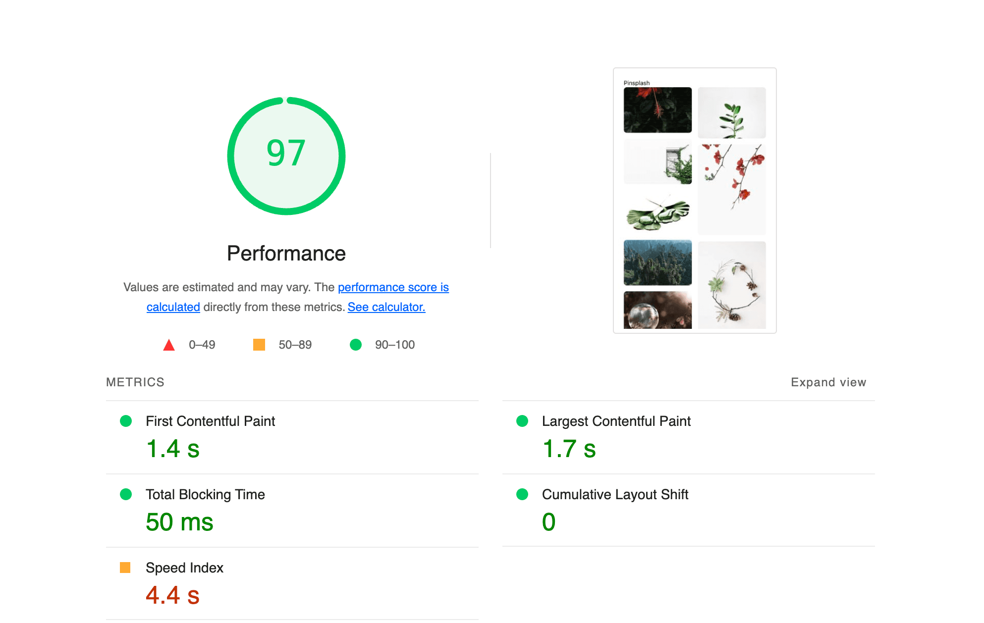
To validate our improvements, we conducted a Lighthouse audit in a production environment. The following image highlights the app's performance metrics, showcasing improvements in LCP, CLS, and Total Blocking Time (TBT):

The production results are highly satisfying for a client-side rendered application that displays images on the initial rendering, showcasing optimized loading and seamless user experience despite the inherent challenges of handling media-heavy content.
Looking Ahead
While the layout is now functional and performant, accessibility remains a critical aspect to address. In the next article, we will focus on the challenges faced by keyboard users when navigating through the grid. A common issue in masonry layouts is the lack of a logical tabbing order, making it difficult for users to navigate between elements efficiently.
To illustrate this issue, here’s a video showcasing the current state of keyboard navigation:
The keyboard user has to tab through two columns of pins before finally reaching that item. This is counter-intuitive and frustrating when the desired pin is right at the top. This layout approach results in an inefficient DOM order for keyboard users, and is a deal-breaker. Moreover, when combined with an infinite scroll list, this issue is exacerbated, making navigation even more cumbersome and inaccessible.
In the next part of this series, we will dive into strategies to improve accessibility, ensuring the layout is inclusive and user-friendly for all.